1. DESIGN WITH A PURPOSE
With its visual, stylish simplicity, contemporary Swedish design has taken the world by storm and symbolises the perfect marriage of form and function. In other words, design with a purpose. To distill a concept through a pragmatic, yet bright lens is a common characteristic throughout all fields of Swedish design. Indeed, we worship the true beauty in everyday objects!
To realise our vision for the new label designs we partnered closely with one of the leading, award-winning design studios in Europe. Our goal was to bring the product family up to date and infuse each product with a distinctly premium Swedish aesthetic. In the process, we wanted to create a cohesive range that invites and attracts our consumers, along with an exclusive feel that does justice to the quality of the product benefits. It was also vital that the designs convey the story of each product, in an equally emotional and rational expression – to make our consumers fall in love with our products, and to ensure they are user-friendly and easily navigable, as a complete range and on an individual product level.
“To realise our vision for the new label designs we partnered closely with one of the leading, award-winning design studios in Europe.”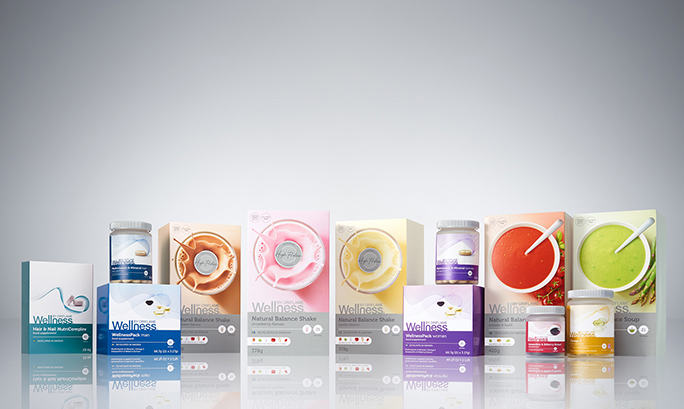
2. WIN FOR YOU, WIN FOR THE ENVIRONMENT
Increasingly, modern Swedish design has also focused on sustainability and that’s why, when you peek inside any new-look Wellness by Oriflame product box, you’ll notice one thing – no leaflet!
Sustainability is something Oriflame takes very seriously and, whenever possible, we take steps towards becoming even more sustainable. During the redesign of our Wellness by Oriflame products we identified an opportunity to do just that, by removing the leaflets. In doing so, paper wastage is cut dramatically which means, with every product you buy, you’re doing good – not just for yourself, but the environment too. All the information you used to find in the leaflet is now printed conveniently on the back and sides of the box.
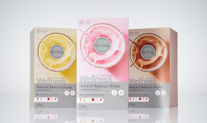
3. INSPIRED BY COLOURS OF SWEDISH BUILDINGS
Through major cities to the tiniest villages of Sweden, one thing is apparent when it comes to Swedish architecture: the colours of the buildings. Cinnamon, olive green, reds and even splashes of pastel pinks, yellows and blues live side by side, creating a wonderfully eclectic palette that has been a Swedish hallmark for centuries.
Inspired by its enduring appeal, we incorporated many of these beautiful hues in the creation of our new labels as a subtle way to celebrate our Swedish heritage. Importantly though, we also wanted to maintain the Wellness by Oriflame brand identity which has become so recognisable around the world over the last decade, so we kept the vibrant purple colour on our bestselling Wellness Pack woman and Multivitamin & Mineral woman packs.


